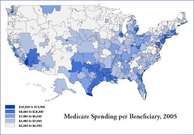
For what it is worth, I am not sure one can take away as much from this graph as it initially suggests. At least you cannot if your initial reaction is similar to mine- we now spend so much money on health care in the US that the spending is starting to crowd out other spending such as smaller primary school classroom sizes or better road safety, etc... all of which MIGHT have a larger effect on our median national longevity per dollar of money spent than spending another dollar on health care might have- clearly some types of health care spending have diminishing returns. For there are many other explanations that are just as plausible and which I will not address here today.
 Anyway, what this data does strongly suggest to me is that it
 was no accident Massachusetts was the first state in our union to pass universal health coverage. The uninsured have a bigger problem there than in other areas of the country. Further, human nature what it is, the citizens of Massachusetts followed the same old rule: spoil the commons before they actually need to make painful personal choices. For while it may not be completely clear from this data, a clever reader should immediately recognize that universal coverage in Massachusetts did nothing to address their TOTAL SPENDING issue (and indeed, as many of you may already be aware, spending has actually increased since universal coverage was passed).
Another suggestion from these charts is America MAY be in the midst of the granddaddy of all health care spending bubbles. And IF this is true, it is likely that states like Massachusetts (and regions like Long Island), where far more money is spent per person than in (say) Arizona or Georgia, are likely at the greatest risk for a severe contraction should the bubble pop. For even if all states in the union equally spend 16% of their GDP on health care, Massachusetts' 16% would be on a much higher dollar per person. And while one could argue this must reflect Massachusetts larger wealth per person, one forgets the chicken and egg nature of economic bubbles- more health spending begets a stronger local economy which in turn begets more health spending, etc... So if the 16% were held constant, but there was a more equitable redistribution of the money spent per person between (say) Georgia and Massachusetts, the net effect would cause a MUCH greater contraction in Massachusetts' economy than in Georgia.
Further, were the 16% national GDP devoted to health spending to contracts to (say) 11%, which is much closer in line with other OECD countries, Boston and Long Island would be in very BIG trouble as they would face a reduction on both an absolute and a % basis. Under such a scenario, Boston or Long Island could easily see an economic contraction on the order of 8 to 9% (which would be a very nasty recession indeed).
Living under the aegis of big government spending can be very risky, in fact every bit as risky as living under the aegis of free market private corporations, as the residents of any town that has been downsized under BRAC realignment can attest.
Risk is always conserved and bubbles are inevitable.
